


The Most Comprehensive Guide to KPI Dashboards
Written by
James Watney
Last updated on
November 4, 2022

Whether you work for a five-person operation or for an enterprise, you should consider building KPI dashboards. They allow you to review your most important business metrics in a snapshot.
Tracking KPIs in an easy-to-access dashboard also helps increase the number of data-driven decisions, shortens the decision-making process, and aligns team priorities.
After reading this comprehensive guide, you'll have a complete understanding of KPI dashboards and be able to build one for your business.
Here’s what you’ll learn:
Want to see if Trevor.io would work for your team? Get started for free!
What are KPI dashboards?

Source: Trevor.io
KPI dashboards are visual and interactive representations of your most important business metrics. They offer a way of reviewing updated key performance indicators at a glance. While similar, these dashboards shouldn’t be confused with Google Sheets or Excel KPI reports.
To create a KPI dashboard you need to get BI software, it can be hosted on the cloud or on-premise. Then, you have to connect it to your data sources and build queries to come up with interactive graphs.
Key performance indicators (KPIs) vs objectives and key results (OKRs)
Both OKRs and KPIs measure team performance and progress towards goals, but they do have differences.
OKRs are a framework for setting goals that facilitate team alignment and growth. The O stands for ‘Objectives’ and refers to your team or company’s big ambitious goals. KRs mean ‘Key Results’ and refers to the small measurable actions that will help you work towards your bigger Objectives.
KPIs, or Key Performance Indicators, are singular goals that need to be achieved to ensure a team or company’s success. They’re quantitative metrics that measure progress towards crucial performance targets.
For example, if you’re setting OKRs and KPIs for your marketing department, you could differentiate them like this:

Related Post: KPI vs OKR: Understanding the Differences & How to Apply Them to Your Business
KPI dashboard examples
KPIs need to be specific and measurable. That’s why it’s important to define KPIs for all the departments of your business. But you don’t need all the detail when it comes to reviewing metrics, you just need to have case-specific KPI dashboards for easy analysis. Some dashboard examples include:
KPI dashboard for startups
Building a KPI dashboard for startups is a great way to shorten the decision-making process by having access to your most updated business insights at a glance. You can access this type of dashboard if you’re thinking of changing the business strategy to accelerate growth or just want to have easy access to your business metrics. Some KPIs you can’t miss are:
- Churn and conversion rates
- Monthly users (new, active, and inactive)
- Monthly and annual recurring revenue (MRR/ARR)
- Cash flow, account payables and receivables

Source: Trevor.io
Sales KPI dashboard
Building this type of dashboard can be highly beneficial to your sales department. If you have sales reps working in different locations, a KPI dashboard can make the goal alignment process easier. With a sales KPI dashboard, you can have access to the most relevant department KPIs in the same place, some metrics you can include are:
- Sales target
- Average sales cycle length
- Customer acquisition costs (CAC)
- Average revenue per unit (ARPU)

Source: Datapine
KPI dashboard for SaaS
In SaaS businesses, writing quality code is almost as important as keeping track of metrics. In many cases, you can identify bugs and software issues by reviewing your SaaS KPI dashboard. In fact, setting north star and counter metrics can act as guardians of your most important features. Some KPIs you can include in this interactive visualisation are:
- Churn and conversion rates
- CAC and customer lifetime value (CLV)
- Activation rate
- Net promoter score (NPS)

Source: Geckoboard
Business KPI dashboard
Similar to the one for startups, a business KPI dashboard helps key stakeholders have a full picture of the business performance. By always reviewing the most updated KPIs, you can shorten the decision-making process, forecast new scenarios, and review business trends. To build your own, you should:
- Map out your business goals
- Discover what the end user need
- Determine your KPI dashboard software
- Add your data sources
- Create data visuals
- Gather feedback from users
- Launch and update your KPI dashboard

Source: Trevor.io
Nonprofit KPI dashboard
As a nonprofit, you need to answer different stakeholders and be accountable for the way you manage your funds. Transparency is crucial for a nonprofit’s success. That’s why a non-profit KPI dashboard is a great way of doing transparent reporting, captivating stakeholders, and forecasting future scenarios. Some KPIs that you can't miss are:
- Financial metrics such as year-on-year revenue and cost per dollar raised
- Volunteer data like total number of volunteers and attendance to events
- Marketing metrics such as new volunteer signups and total conversion per channel
- Fundraising donor information like donor lifetime value and average gift amount

Source: SolverGlobal.com
Insurance KPI dashboard
People get insurance to protect themselves, keeping track of metrics is a way of protecting your business. Insurance KPI dashboards help stakeholders keep track of metrics to improve payment times and review claim costs and high-risk clients. Some of the KPIs you should include in this type of dashboard are:
- Average cost per claim
- Revenue per policyholder
- Time to settle claims
- New and renewed policies

Source: SolverGlobal.com
Marketing KPI dashboard
Creating a KPI dashboard for marketing can be tricky because you can measure the same metrics for different marketing practices. A good way to approach this is to divide your different marketing efforts and build a dashboard tailored to each one.
For example, you can have an SEO, social media, or paid media marketing dashboard. You could also have a high-level marketing dashboard to review the most important KPIs from the different practices. For the generalistic marketing dashboard, these are some of the metrics you can’t skip:
- Organic and paid traffic
- Social media followers, subscribers, or page likes
- Engagement rate
- Pay-per-click or cost per lead

Source: Klipfolio
KPI dashboard for project management
Project managers rarely work on a single project at a time. If they work for different clients, they might even need to use different task management tools. That makes their job tiring and time-consuming since they need to open different apps to review the project status.
A project management KPI dashboard can be a huge help for PMs, especially if they include these KPIs:
- Project schedule
- Current project backlog
- Budget variance
- Number of change requests

Source: AssessTEAM
Dashboard for interactive cohort analysis
Business department heads need to be able to analyse cohorts to improve customer satisfaction. Building a dashboard for interactive cohort analysis can help them visualise cohort behaviour and trends in a snapshot. For this interactive visualisation to be helpful, you should include these KPIs:
- User retention
- Page views per user
- Session duration per user
- Average order value (AOV)
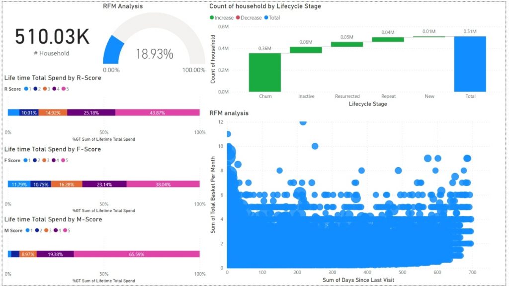
Source: Donato TH on Medium
5 KPI dashboard benefits
Building KPI dashboards for your business comes with several benefits that can improve your business performance.
1. Paint a full picture of your business performance
Monitoring your business metrics in real-time allows you to keep an eye on business health. With this data, you’ll be able to make informed decisions and refine your strategy as needed. Also, keeping a historic track of your business data lets you forecast future scenarios and avoid previous mistakes.
2. Streamline your decision-making process
To make fast data-based decisions, you need to have easy access to your most updated metrics. Without KPI dashboards, this information usually gets lost in email threads or in unfriendly and hard-to-access reports.
3. Forecast new scenarios and opportunities
KPI dashboards are interactive, which means that you can do more with the data that’s presented in a one-pager. You can use drill-downs, filters, and drill-throughs to review more information. And can also use the data to review historical trends, discover business opportunities, and forecast the viability of new scenarios.
4. Scale your business with a focus on data
KPIs help you monitor your performance toward planned goals. As your business grows, it’s easier for people to lose track of what’s important. KPI dashboards make it simple for everyone to be aligned on priorities and help you build a data-driven culture that sticks no matter how much you grow.
5. Foster collaboration
Teams can communicate through KPIs. Just by reviewing the department KPI dashboard, everyone is able to define their priorities based on the data. It’s also a way for team members to collaborate and work together to close gaps.
KPI dashboard best practices (and common mistakes)
If you’re designing a KPI dashboard for someone else, it’s crucial that you’re able to put yourself in the shoes of the end user. Here are some best practices to follow and common mistakes to avoid.
Best practices
To make the most out of your KPI dashboard, you should make sure to:
- Truly understand your end user needs
- Make your data easily accessible
- Choose the right type of dashboard for the data that you’re presenting
- Activate real-time data updates
- Automate alerts to get notified if anything requires immediate action
- Tell a story with the order of your KPIs
- Contextualise the data
- Make it interactive
- Gather feedback from end users
Common mistakes
KPI dashboards are easy to build, especially if you use a no-code tool like Trevor.io that lets you create data visualisations within seconds. However, it’s common to make some of these mistakes:
- Misunderstanding the purpose of the dashboard
- Trying to cover all metrics in the same dashboard
- Making a bad use of colour (i.e., using red to highlight a positive result)
- Not following internal colour codes (i.e. a client has always been associated with green, but you use purple instead)
- Trying to make it perfect for everyone (you just can’t!)
- Getting into too much detail in the overview
- Using a tool that requires manual data updates like Google Sheets or Excel
- Not contextualising data
Why you need a KPI dashboard tool and some options you should try
You need to get a KPI dashboard software to simplify your decision-making process but also to reduce the time spent building lengthy reports that usually end up getting buried in people’s email inboxes.
Also, business intelligence tools simplify your work. You could walk from London to Wales, but it’s much more effective and comfortable to go by car or by train. Similarly, you could build data reports and dashboards in Google Sheets, but using a proper BI tool will be much easier and more effective.
Get on the fast train, and try one of these BI tools:
3 best BI software for building KPI dashboards
Some of the best BI software that you can get to build your KPI dashboards are:
Trevor.io

Source: Trevor.io
This is a truly no-code data analytics tool that allows you to create eye-catching dashboards and build unlimited queries in just a few minutes. Trevor.io integrates with almost all SQL databases and manages to connect to many other data sources using the Zapier integration.
Trevor.io is best for businesses of all sizes, but since it’s extremely lightweight and the price doesn’t change per user, startups and growing organisations will feel right at home.
Tableau

Source: Tableau
Owned by Salesforce, Tableau is a great option for users who are tech-savvy enough to learn the VizQL programming language. Among the biggest benefits of Tableau are that it allows you to create geographic and interactive maps and offers a drag-and-drop interface for query and dashboard building.
Tableau is best for medium to enterprise-level companies that have a data engineer team to create business dashboards for the different departments.
Power BI

Source: Microsoft
Power BI has a similar interface to Excel and that makes it easy to understand. It uses a natural language query builder and lets you automate workflows using other Microsoft tools like Power Apps and Power Automate.
Power BI is a great solution for enterprise-level technical teams that need to connect to multiple data sources and small businesses that have a data team responsible for building dashboards for the organisation.
Can you use Excel and Google Sheets templates for KPIs?
It’s possible to use Google Sheets or Excel templates to build a KPI dashboard. But they’re not going to allow the same levels of interactivity, customisation, or visualisation options of dedicated business intelligence software. Also, these tools usually require a lot of manual intervention to adjust formulas and update the database. It’s a much better idea to use software designed to build KPI dashboards.
How to build your KPI dashboard
KPI dashboards are only beneficial when users actually find them relevant and easy to use. That’s why if you’re creating one for someone else you should follow this guide to dashboards and:
- Define your end user. Determine who will be using your dashboard, what’s their role, seniority, and the level of detail that they need.
- Ask a lot of questions. Make sure you truly understand how the end user will make use of the dashboard and in which scenarios they’ll be accessing it.
- Choose a KPI dashboard tool. There are thousands of dashboard tools available online, most of them are good, but not necessarily good for you, so you need to research and choose one that suits your needs.
- Define the layout following design principles. There are eight different design principles that you can apply to KPI dashboards to ensure they’re easy to read, have colours that tell a story, and aren’t overcrowded with information.
- Determine your data visualisations. Depending on the tool you choose you might have different options, define which visuals tell the right story of each KPI.
- Choose the type of dashboard. Dashboards can be analytical, strategic, operational, or tactical. Define which one you need to create and use it as a guide for your design process.
- Sketch it out and gather actionable feedback. Before you spend too much time bringing the data together and building visualisations, draw a sketch and share it with the end users. Gather and implement their feedback.
- Link your databases and build the dashboard. Once you have the sketch approved, you just need to build and position data visualisations in your dashboard.
- Test it and gather feedback again. Make sure you test your dashboard on different devices and with different stakeholders. Get their feedback and make final adjustments.
How to empower your team with BI software
Being able to make prompt data-driven decisions in a fast-paced environment is a competitive advantage. The one who wins it’s not necessarily the best one but the one who got there first. Creating and using KPI dashboards to accelerate that process is a must.
Plus, with the right BI software, you won’t need to make too much effort to get impactful results. Trevor.io is a great option for companies that want to democratise data access and empower their team to make informed decisions on the spot. Trevor.io allows you to give access to unlimited users for the same price and adjust each user’s permissions to ensure data security.
Want to see if Trevor.io would work for your team? Get started for free!
