


How to Design a KPI Dashboard Your Team Will Actually Love to Use
Written by
James Watney
Last updated on
December 2, 2022

You might already know that dashboards need to be colourful, visual, and interactive. But, what does that mean in practice?
- Should you add bar or pie charts?
- How many colours are enough without causing distractions?
- How do you know if it’s going to be valuable?
- Where should you do it?
When KPI dashboards are well-designed, they increase the number of informed decisions and reduce the time spent analysing data. The issue is that the one who uses the dashboard is rarely the one who designs it, especially in big companies that have a centralised data engineering team.
Learning how to do KPI dashboard design isn’t rocket science, but it requires a sharp eye for detail and some practice.
By the end of this blog, you’ll be able to design a killer visualisation following dashboard best practices to make it not only eye-catching but also useful for the end user.
Table of contents
Want to see if Trevor.io would work for your team? Try it free for 2 weeks!
What is KPI dashboard design (and is it even worth it)?
KPI dashboard design is the end-to-end process of creating one-page interactive, visual reports. It begins with connecting your data sources and ends with adding powerful graphics and visualisations to your dashboard.
Designing a KPI dashboard also means having the end users’ interests and needs in mind. Hence, knowing how to create a dashboard becomes more than just adding data points to a whiteboard.
Benefits of designing an interactive KPI dashboard for business data
It’s a fact that reviewing KPIs is key to successful businesses. But why should you design a KPI dashboard to review department analytics in the first place?
- To shorten the time users spend accessing their data, and therefore, increase data-driven decision-making
- To align everyone on business key performance indicators and priorities
- To reduce the time spent reviewing metrics in different tools and places, and creating data reports
- To have timely alerts in case your KPIs drop and you need to trigger actions
- To foster a culture of empowerment and open communication by sharing information
- To gather deeper insights from an apparently simple data visualisation using drill-downs, filters and drill-throughs
How to design a KPI dashboard to meet your business objectives
When looking for a KPI dashboard tool, you want the platform to be easy to master so that you can create relevant dashboards fast. Your dashboards should also simplify the way people access data and enable them to make data-driven business decisions.
If your team don’t find your dashboards intuitive to use, they won’t get used and your company will soon stop paying for the tool. Here’s a complete guide to dashboard design to stop that happening, and help you create handy data visualisations in just eight steps.
1. Ask questions during the KPI dashboard design process
Imagine you’re a designer that’s working on a company logo. The first thing you should do is talk to the client and ask questions to get a deeper understanding of the assignment. What they want, who the target audience is, which colours represent the brand, and what the brand personality is.
You should do the same thing when designing a KPI dashboard for yourself or others. That’s why you need to get the answers to the following questions:
- Who’s going to use it? And why do they need it? You need to truly understand their job and what they’ll use it for. Ask detailed questions to understand how the dashboard will play a role in their day-to-day tasks.
You should also ask how they learn better. Maybe they’re extremely visual, or they need a few tables or dynamic text boxes to go along with the charts for better understanding.
- Which metrics will help them do their jobs? Make sure you get a list of all the most crucial metrics and when they’re most likely to look them up. Ask them to assign a level of importance to each KPI so you can experiment with sizes and in-dashboard placement.
- Where to get the data? Ask if they use specific tools for their role, i.e., a CRM. Get the credentials so you’re able to connect your dashboard to specific software.
- Do they already use any visual associations? This is one of those things that can make a huge difference for your users but is actually a really simple thing for you to do. Ask if they already associate certain metrics, projects, or tasks with a specific colour or icon. The dashboard you design needs to speak the same language, so if they’ve been using a colour for a specific client, then your dashboard should too.
2. Decide which KPI dashboard software is best for you
There are hundreds of different dashboard tools that you could use. They vary in price, users, and complexity. Here are some of the best ones depending on your needs.
- Trevor.io - best for startups, growing businesses, and SaaS. Trevor.io is a truly no-code data analytics tool. Even at the most basic level, you can create unlimited ad hoc queries and invite unlimited users. This tool offers granular security to limit access to certain databases. Also, since Trevor.io doesn’t ever copy your data, it’s extremely lightweight and scalable.
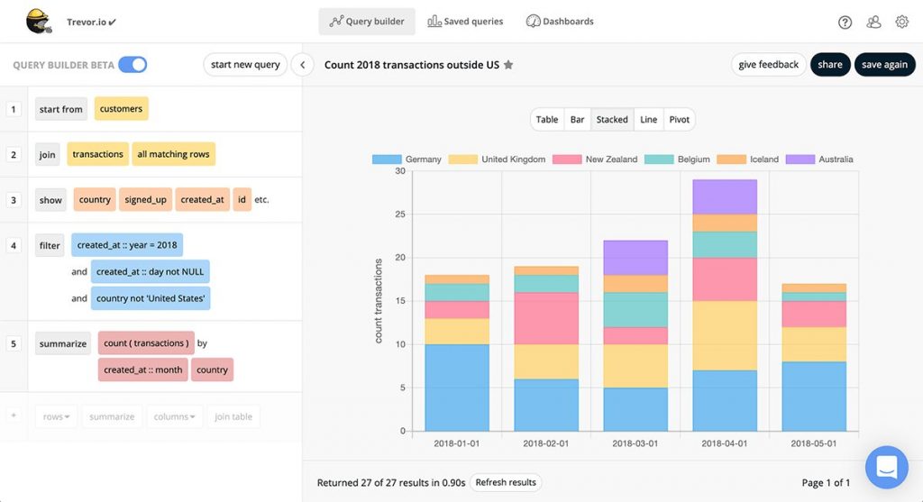
Source: Trevor.io
Want to see if Trevor.io would work for your team? Try it free for 2 weeks!
- Apache Superset - best for tech-savvy companies. Apache Superset is an open-source dashboard tool that’s perfect for companies with a dedicated data engineering team. Since it’s open-source, it’s free and allows you to customise it as you want. The downside is that it’s less scalable because it requires users to know SQL programming language.
- Tableau - best for enterprise-level companies. This dashboard software provides high-quality interactive data visualisations. You don’t need to use SQL for simple dashboards, but you might need to write SQL scripts for more complex queries. Tableau connects to data warehouses and online analytical processing (OLAP) cubes. It’s great for big companies that have a centralised data engineering team.
3. Choose your KPI dashboard layout using design principles
Dashboards need to be visually appealing and easy to follow. Use the information you gathered in the first step and apply these design principles to your dashboard to improve the user experience:
- Alignment. Make sure your charts, tables, and dynamic text boxes are following imaginary lines. So if you have three columns of content, ensure everything in each column has the same length and is aligned with one another.
- Hierarchy. Not every single data point has the same level of importance. Use that information to play around with sizes and positions. Add the most important KPIs at the top left.
- Contrast. Use colours that make a contrast. Using light yellow letters over a darker yellow background might not be the best idea since this combination makes no contrast. You can use opposite colours in the chromatic circle, or you can also play around with contrasting fonts and thickness.
- Repetition. Use the same colour palette and fonts to ensure a clean and branded design. Avoid mixing too many colours because that confuses the user.
- Proximity. Add similar metrics together. If you’re building a startup KPI dashboard and need to add metrics for each department, put all the ones that are related to the same one together.
- Balance. Keep a clean and decluttered design balancing the elements of your dashboard. If you have too many dark colours, the background should be light. If you have too much information on one side, you should try to arrange it proportionally across the board.
- Colours. Colours are really powerful. Each one tells a different story. Use them properly. For example, red usually means that something is wrong while green means that you met your target.
- Negative space. Don’t be afraid to leave some empty spaces. A balanced layout that uses neat alignment and some negative space allows the eyes to focus on important information.
Source: Jaxon White on Medium
4. Know which data visualisations to use (and when)
Dashboards can include more than a typical bar chart. Get to know your dashboard features and available visualisations before you start organising your data. Some of the most common options include
- Bar charts for time-related comparisons. For example, e-commerce sales YTD, or social media followers per platform.
- Line charts to represent trends. For example, MQL growth from Facebook Ads month over month in a marketing dashboard.
- Pie charts for simple composition like demographics. For example, sharing the percentage of male and female buyers of a particular product.
- Tables to share a composition, comparison, or relationship with a few data points. For example, in a project management dashboard, you can share a list of the most important 10 tasks to do in a week.
- Pivot tables to summarise analyses that contain more hidden data. For example, if you sell different products under different categories and want to show an overview by category and not by product.
- Dynamic text boxes to highlight a standalone metric like a widget. For example, the number of active app users.
5. Choose your type of dashboard
The next step in the design workflow is to get familiar with the different types of dashboard, and choose one to guide your dashboard design process. These are
- Analytical dashboards. Gather a large amount of data for specialists to analyse.
- Operational dashboards. Add real-time metrics for day-to-day use.
- Tactical dashboards. Mix operational and strategic KPIs for mid-management review.
- Strategic dashboards. Collate metrics that paint a big-picture of the business and allow for long-term planning.
6. Build a KPI dashboard sketch and get your team’s feedback
Before you spend too much time designing the perfect dashboard, you should sketch out a rough idea of how it would look. Use dashboard examples for inspiration. Then, ask for the end users’ feedback and make adjustments.
Make sure you’re really thorough when asking for feedback to properly understand what the end user will actually do with the data.
7. Connect your data sources and build your dashboard
If you’re using Trevor.io, setting up your tool and adding your data sources will take less than five minutes. Then, you can start playing around with the software to get your first dashboard ready.
Follow your sketch, set up your queries, make them visual, and choose the colours, fonts, and placements. Do that for all your KPIs, and share it with key stakeholders once you finish.
8. Test your dashboard on different devices and get feedback
Ask users to test it out on several devices and give you their feedback. Once you’ve made the adjustments, you can move on to create the next dashboard.
Is it possible to design a KPI dashboard properly?
Yes, you can design a high-value KPI dashboard for personal use or other stakeholders in a few hours. It’s not a difficult task to do, but it has several design considerations.
Here’s a recap of the eight steps you should follow to create an eye-catching, useful, easy-to-follow, and decluttered KPI dashboard.
- Get to know your audience and their needs
- Choose the right tool for you and your business
- Get familiar with design principles
- Study your different types of visualisations
- Choose a type of dashboard
- Work on a sketch and gather feedback from users
- Build your dashboard
- Test and gather feedback again
You don’t need to have a superb eye for design when building your dashboard. You need to find an easy-to-use tool that will do most of the work for you, so you can add visualisations as pre-built blocks. Trevor.io is a great solution since it’s truly no-code, and it can help you create expert-looking dashboards in under a few hours.
Want to see if Trevor.io would work for your team? Try it free for 2 weeks!
Frequently asked questions about KPI dashboard design
What are KPIs in dashboards?
KPIs are what feed dashboards. These data points and comparisons are transformed into visual representations of data for easy analysis.
What’s a KPI dashboard example?
You can make KPI dashboards out of everything you measure. Some examples of KPI dashboards are:
- Startup KPI dashboards. These include the most relevant business metrics.
- KPI dashboards for SaaS. Contains the most relevant KPIs for SaaS businesses.
- Marketing KPI dashboards. Collates relevant data points of marketing campaigns and social media.
How do I create a KPI dashboard in Excel?
You can create KPI dashboards using Excel. What you need to do is:
- Create a hidden tab with all your raw data
- Build tables, charts, and pivot tables as needed
- Add them to a different tab and add text boxes when required
While creating dashboards on a spreadsheet is possible, it’s always better to use a dedicated tool like Trevor.io to ensure your data stays up to date and error-free.
