


Building a Powerful Dashboard for Interactive Cohort Analysis That’ll Improve Customer Retention
Written by
James Watney
Last updated on
January 25, 2024

You’ve done all the work to get customers through the funnel until they convert. Now, you need to find ways to retain them. The best way to improve customer retention is by doing cohort analysis.
Segmenting your customers into cohorts lets you analyse the behaviour of those groups of people over time as they reach the same milestones. A great way to review your data easily is by building a dashboard for interactive cohort analysis and using drill-downs and filters to review cohort performance side by side.
After reading this article, you’ll have a clear understanding of what cohorts are and how to create your own cohort analysis interactive dashboard to boost customer retention.
Check out these design tips on how to build practical, engaging analytics for your customers
Table of contents
Want to see if Trevor.io would work for your team? Get started for free!
What is cohort analysis?
Cohort analysis is the practice of grouping people that share common characteristics and analysing their behaviour over time. That way you can compare different cohorts' progress and trends.
For example, if your cohorts are separated by sign-up month, you can review the retention of those groups after months one, two, three, and so on. This will help spot trends, like a drop in users after month four. You can also gather insights on your interventions to increase retention over time.
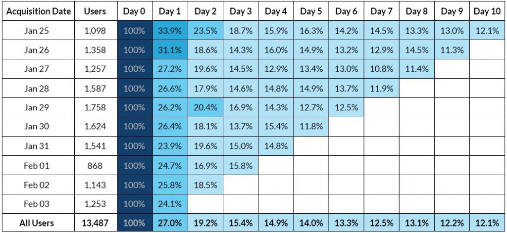
Source: The Mobile Spoon
Types of cohorts
There are three main types of cohorts
- Size-based: related to the amount of money your clients have budgeted to spend on your product. For example, if you sell auto parts to different businesses, you can separate small auto shops, car dealerships that offer mechanic services, and multinational retailers based on the size of their spending.
- Segment-based: this one is similar to size-based, but groups people based on their subscription plan. For example, at Trevor.io, we can segment our users into cohorts based on which plan they use, starter, pro, or enterprise.
- Time-based: this is one of the most common groupings. Cohorts that are based on time, separate customers based on when they complete specific touch points. For example, you could segment customers that bought the product in January vs in July.
Why you need a cohort analysis dashboard
Reviewing your business data on visual and interactive dashboards has several advantages like being able to make more data-driven decisions or democratising data access. The same applies to cohort analysis, along with some other benefits that include:
- Identifying cohort trends. Reviewing the data of different cohorts lets you identify repeating patterns. By reviewing cohorts side-by-side, you’ll be able to spot if there are sudden drops in retention or any other KPIs.
- Increasing lifetime value and retention. Analysing your cohorts will highlight areas of improvement. By tackling them, your customer lifetime value and retention rates will go up.
- Reviewing the performance of your action plan. If you made any product changes or upgrades, you can use cohort analysis to see if those improvements paid off. For example, if you identified that your customers were leaving in the third month because your app had a steep learning curve and not enough training or tutorials, you can use the cohort analysis dashboard to track intervention efforts.
- Improving your conversions through the funnel. As your potential customers go through the funnel you’ve planned for them, you can segment them into cohorts to review conversion trends and optimise touchpoints to improve sales and sign-ups.
How do you make a cohort chart with different analysis tools?
There are a few ways to build a cohort chart using different analysis and dashboard tools. You can build one on a spreadsheet app like Google Sheets, or by using a dedicated BI tool like Trevor.io.
Google Sheets or Excel
If you know how to write functions and create pivot tables, you can build a cohort chart using one of these spreadsheets. Especially if you’re doing this to review past data. However, if you want to have this file updated in real-time, these platforms won’t be as useful since it requires a lot of manual intervention to keep them updated.
Using a dedicated BI tool
With a no-code business intelligence tool like Trevor.io or Tableau, you can create any type of visualisation. You can build a marketing, startup, or business KPI dashboard in minutes. You can also connect your data sources to these or any similar software and build powerful cohort analysis charts in a few minutes.
Which is best?
You can build cohort charts and interactive dashboards on Excel or Google Sheets, but it's a time-consuming and ineffective solution. To make the most out of your time and data, you should consider using business intelligence software.
If you’ve tried BI software like Tableau before but you’re looking for alternatives, Trevor.io’s unlimited no-code ad hoc query builder could be the answer. Trevor.io is a great fit for anyone who wants to review their data with an extraordinary level of granularity. It lets you add unlimited filters to your queries so you can get the most out of your database.
Want to see if Trevor.io would work for your team? Get started for free!
Step-by-step guide to building a cohort visualisation dashboard
If you’re planning to build a cohort visualisation dashboard, you should follow these steps to guide your dashboard creation process.
Step one: Choose your business intelligence software
The first thing to do is to decide which BI software you’ll use to build your dashboard. You need to define:
- If it’ll be hosted on the cloud or on-premise
- If those using it have any software development knowledge (and therefore how low-code your tool needs to be)
- How much you’re willing to spend on software
- If your preferred option can actually connect to your data sources
- If it has any query or user limitations that might cause you to go over budget as your requirements grow
If you happen to be looking for a BI tool that’s truly no-code, offers unlimited queries and users, is extremely lightweight, and connects to most SQL data sources directly - try Trevor.io.
Step two: Think of the end user
Whether you’re designing a dashboard for yourself or others, you should define the end user, context, and use cases. Cohort analysis, or any other form of dashboard, is only valuable if the end-user can get the information they need just by looking at them.
For example, if the dashboard user is always reviewing their marketing KPI dashboard five minutes before meeting the leadership team, then, you should make sure that they can visualise the biggest achievements and areas of improvement at a glance.
But if they’re reviewing a startup KPI dashboard in-depth before making a business decision that comes with a large budget allocation, then, you need to focus on adding more info accessible through filters, drill-throughs, and drill-downs.
Step three: Sketch the layout using design principles
There are eight design principles that will help you guide your dashboard for interactive cohort analysis design:
- Alignment: ensure everything is aligned in the same direction following invisible guiding lines
- Hierarchy: add the most relevant information at the top and maintain a progression from left to right (similar to how the eye reads)
- Colour: use colours to tell the story of your metrics such as green, yellow, and red
- Contrast: use opposite colours in the chromatic circle for high contrast, easy-to-digest visuals
- Repetition: repeat the same font and colours to ensure consistency
- Proximity: add similar metrics together to simplify readability
- Balance: include dynamic text boxes and charts to balance graphics out
- Negative space: leave some white space to avoid overcrowding the dashboard
Use most of these principles to draw a sketch of the dashboard you’ll be creating.
Step four: Define the KPIs or OKRs to review
You can do cohort analysis to simply review their behaviour over time, or you can track and compare KPIs or OKRs across groups. Adding metrics to each cohort lets you visualise the performance of your most relevant business goals across cohorts. You can add some of these KPIs:
- Customer retention
- Conversion rate
- Customer cohort churn
- User engagement
- Page views per user
- Session duration per user
- Average order value (AOV)
- Customer lifetime value (CLV)
- Orders per customer
- Repeat rate
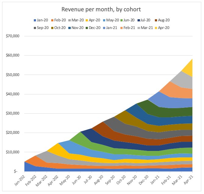
Source: Donato TH on Medium
Related Post: KPI vs OKR: Understanding the Differences & How to Apply Them to Your Business
Step five: Add your data sources and build your queries
Connect to your SQL data directly from Trevor.io, or use the Zapier integration to import big data from different sites. If you’re using a different BI tool, you also need to connect your data sources to enable query and dashboard creation.
Step six: Put your visualisations together
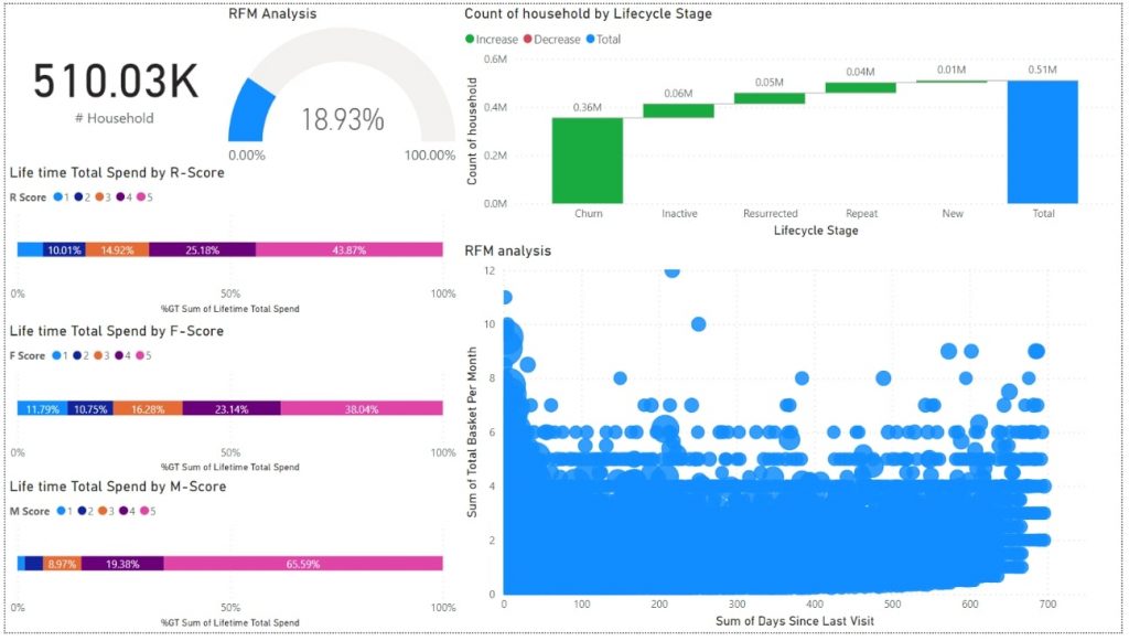
Turn your queries into eye-catching visualisations and arrange them to build your cohort analysis interactive dashboard. Arrange the order of your charts and graphs following the previously designed sketch and review cohort group data. Use a chart to compare your KPIs between cohorts.
Source: CleverTap
Step seven: Test it and gather feedback
Once you finish adding the visual graphs and data analytics, it’s time to test your dashboard. Share it with end users and key stakeholders. Get their feedback and ask a lot of follow-up questions. Let them try it for a few days. If they make any comments, adjust accordingly.
Step eight: Update, set automated alerts, and launch
Go through the feedback, make changes, and launch the cohort analysis dashboard so everyone can use it to improve their product’s performance. Also, if you’re using Trevor.io, make sure you set automated Slack and email alerts. That way your team members can be notified if there are any changes in cohort behaviour without having to access the dashboard.
Want to see if Trevor.io would work for your team? Get started for free!
Let’s recap on cohort analysis dashboards
Cohorts identify groups of people based on shared traits. These can be size, time, or segment-based.
Cohort analysis is a way of reviewing behaviour over time so you can compare different groups at the same stage. You could build a cohort analysis chart in Excel or Google Sheets, but you’re better off getting a BI dashboard tool that lets you automate real-time data updates, enables interactivity, and simplifies the dashboard creation.
If you choose to build your interactive cohort analysis dashboard, you should follow these steps:
- Pick the right BI software
- Put yourself in the shoes of the end user
- Draw a sketch of the dashboard layout
- Determine the KPIs you want to track for different cohorts
- Connect your data sources and build queries
- Create data visualisations
- Gather feedback from dashboard users
- Work on the feedback, automate alerts, and launch
Not sure which software is right for you? Trevor.io is pretty easy to master, so it’s great for teams without much coding knowledge. It’s also lightweight and scalable. That’s because we don’t make copies of your data and we don’t charge extra per query or user, so you can grow your business without breaking the bank.
Want to see if Trevor.io would work for your team? Get started for free!
Frequently asked questions about dashboards for interactive cohort analysis
How do you visualise cohort analysis?
You can visualise cohort analysis on an interactive dashboard to review cohort trends side-by-side, or by building a report using past data on a spreadsheet.
How do you create cohort analysis in Tableau?
To create a cohort analysis dashboard in Tableau, you need to use their level of detail (LOD) expressions. That allows users to calculate aggregations from groups with different levels of detail and then use them in visualisations. Here’s what you need to do:
- Data modelling: choose how you’ll compare the different datasets
- Dataset analysis: review if you’ve already defined metrics to evaluate the data
- Cohort definition: determine the size, common characteristic, timeframe, and metrics to analyse
- Starting point definition: create a parameter for when the analysis will start
- Calculated fields formulation: write formulas to calculate the desired metrics following the previous parameter
While Tableau offers cohort analysis, you’ll need to get familiar with their native programming language for building queries: VizQL. Using Trevor.io, you can define cohorts using the no-code query builder and add as many filters to your data as you need. That way you can compare apples with apples across time without writing a single line of code. Get started for free!
How do you do cohort analysis in Excel?
To build a cohort analysis dashboard in Excel, you need to:
- Import your data to your preferred tab
- Add a column and assign each user a cohort number, you can use a formula to do it automatically based on some size, time, or segment parameters
- Ensure you have a column indicating sign-up month
- Build a pivot table and group the data based on the criteria of your choosing
- Use the same pivot table information to add retention rates
- Create a custom formula to calculate your retention rate by month
- Add the retention rate to each cohort over time
The thing with Excel is that if you want to review this on a monthly basis, you’ll need to update the database every time. Using a BI tool like Trevor.io, you can automatically update your data every hour, day, week, or month. Get started for free!
