


12 Powerful BI Dashboard Features for Successful Decision-Making
Written by
James Watney
Last updated on
December 9, 2022
BI dashboards are a way of shortening the gap between decision makers and data, by giving all the required stakeholders access to visual and interactive information in dashboards. But truly understanding how to use each one of the available features to the fullest can be challenging. In fact, you might be wondering:
- When can you benefit from using drill-downs vs filters?
- How to choose colours that go in line with your story?
- How to automate the necessary alerts without spamming your teammates?
While a BI dashboard can help your business immensely, visualisations can also look cluttered, disorganised, and confusing when they contain too much information or graphs.
In this guide, you’ll learn how to use some of the most common BI dashboard features and get insights on how to apply them in your day-to-day.
Table of Contents
Want to see if Trevor.io would work for your team? Try it free for 2 weeks!
The benefits of an interactive BI dashboard
Once you start visualising data in the form of interactive BI dashboards, you’ll never want to see a table or spreadsheet ever again. Interactive BI dashboards can benefit your business in several ways. When crafted correctly, they can lead to:
- Data-driven decisions
- More efficiency
- Team alignment
- Easy access to data in a few clicks
- Contextualised data and greater understanding of the story behind metrics
- Customisable data dashboards to fit your audience's needs.
BI dashboards vs reporting
BI dashboards and reports may go hand-in-hand but they’re different. Some key differences:
Details vs overview
Reports usually focus on sharing detailed data, while BI dashboards are visual summaries of the same information. Instead of sharing a large table with all the details, dashboards share the same data in a summarised visual way.
Tables vs visualisations
As you already know, BI dashboards are visual, using colourful charts, graphs, and maps. Reports will mostly include detailed tables of information and maybe a few bar graphs.
Reading vs interacting
Reports are usually documents made for reading purposes and may go into detail to explain the data. BI dashboards speak for themselves and allow end users to interact with the data, forecast scenarios, and use filters to view any business metric they need.
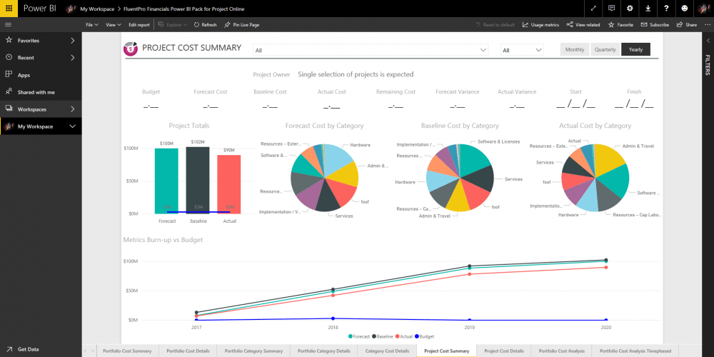
One of the clearest BI dashboard examples that allows users to do forecasting is the financial status dashboard.
Key dashboard features to consider:
Let’s get straight into how to create a BI dashboard and get the most out of its features. Every BI dashboard software will come with a set of features that will help you increase its impact and value. These are some of the most useful ones:
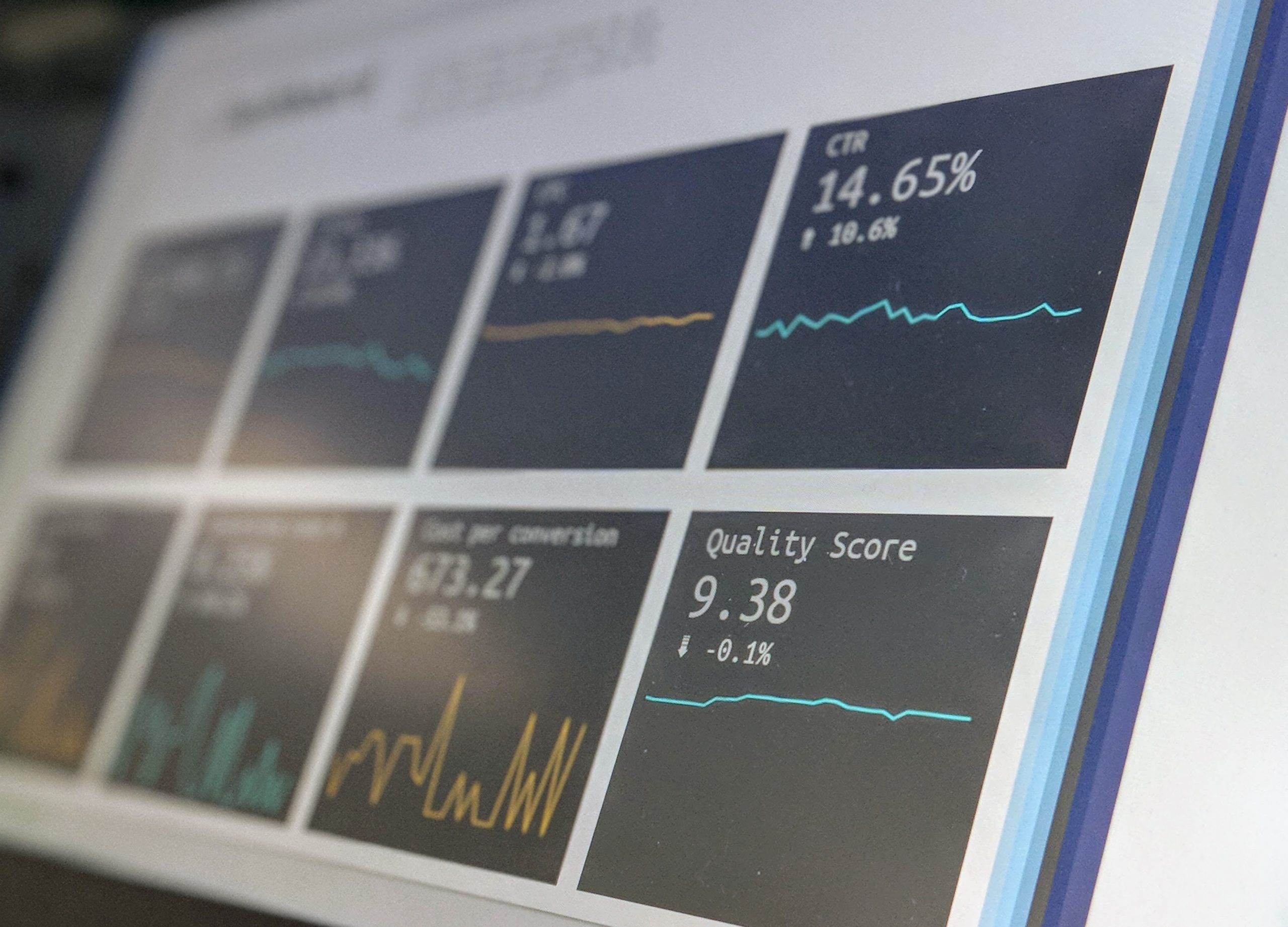
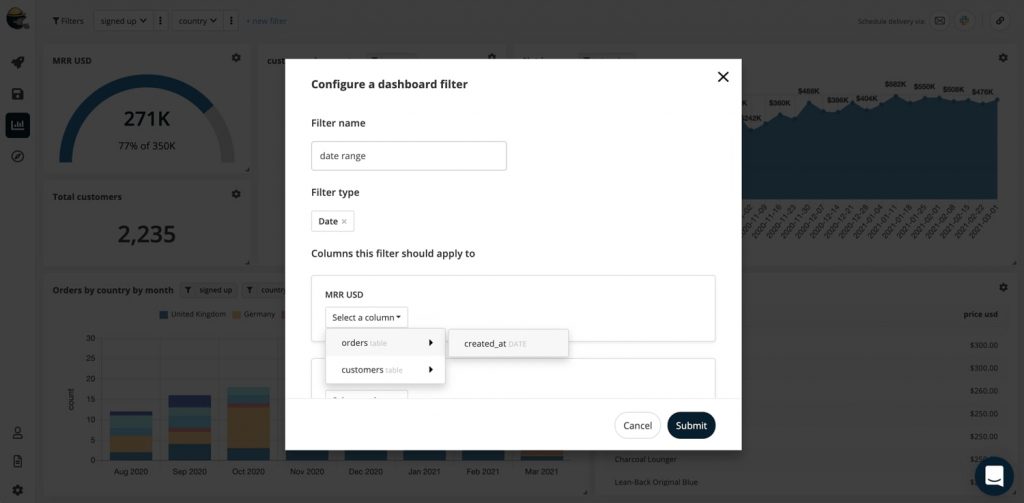
1. Data filters
This has got to be one of the most important features of BI dashboards. Data filters add interactivity to graphs, charts, maps, tables, or any other form of visualisation. This feature allows end users to see different correlations between data segments without needing to create different dashboards.
For example, if you want to share sales data from different regions over time, you can add all the visualisations and business metrics you need to get a full picture. Then, if you want to have a complete view of a specific region or date, you can add a filter to change the information in your dashboard to that request.
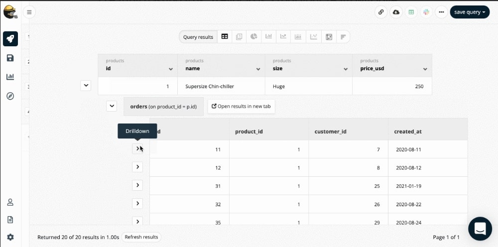
2. Drill-throughs and drill-downs
Drill-throughs and drill-downs are particularly useful when including several data points on a dashboard without showing them in the first snapshot.
Drill-throughs allow users to access additional and detailed information about a particular metric or dataset. For example, if the dashboard shows different KPIs, but you want to double-down on one of them, you can click on it and see another set of visualisations directed at the clicked KPI.
Drill-downs allow you to visualise a particular KPI in detail by linking a chart to a “parent” chart. This way, whenever a user clicks on a data point in the dashboard charts, the layout will automatically change views to the detailed version of the chart or graph.
So, if you’re reviewing sales data on different regions, and you want to narrow the view on how a specific product is performing in a certain location, you can click on the location name in the chart, and you’ll access the detailed data.
The difference between filters, drill-throughs, and drill-downs is that:
- Filters change the view of the complete dashboard
- Drill-troughs take the user to a different set of metrics relevant to the KPI they clicked
- Drill-downs allow the user to review a specific metric in detail.
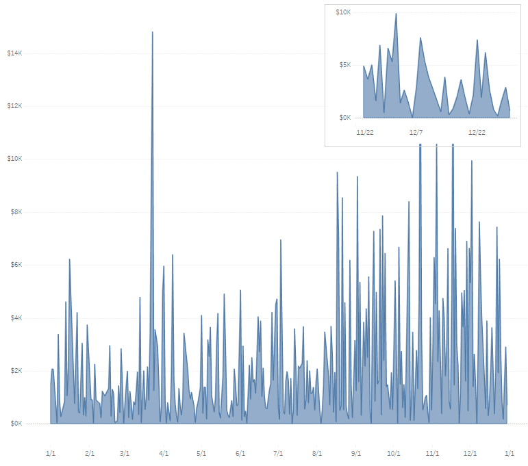
3. Chart zoom
Most dashboard features allow you to dissect data. Chart zoom is no exception. This feature lets you use your mouse to zoom in on data, and access data in the smallest unit of time available.
For example, if you want to review the number of sold units in the past week, but the visualisation shares the data by year, you can zoom in on the time-axis to access the required information.
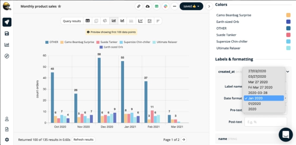
4. Customizable charts
Many BI dashboards software allows you to customise some details, but not others. At Trevor.io your charts have a high level of customisation. Users can rename axes, include missing dates, add custom columns, change colour schemes to match company colours, and compare different data points.
One of the most valuable features that Trevor.io offers is the ability to add custom fields. That functionality becomes particularly valuable when measuring a metric that comes from data correlation, like manually calculating conversion rates, for example.
5. Real-time updates
BI dashboards aren’t only useful for empowering data-driven decision making; they can also be huge time savers, especially when you’re able to activate real-time updates on the data.
Trevor.io lets users set automatic updates so the data in the dashboard visualisation can always be the most updated version possible. This is particularly useful for reviewing daily and weekly metrics.
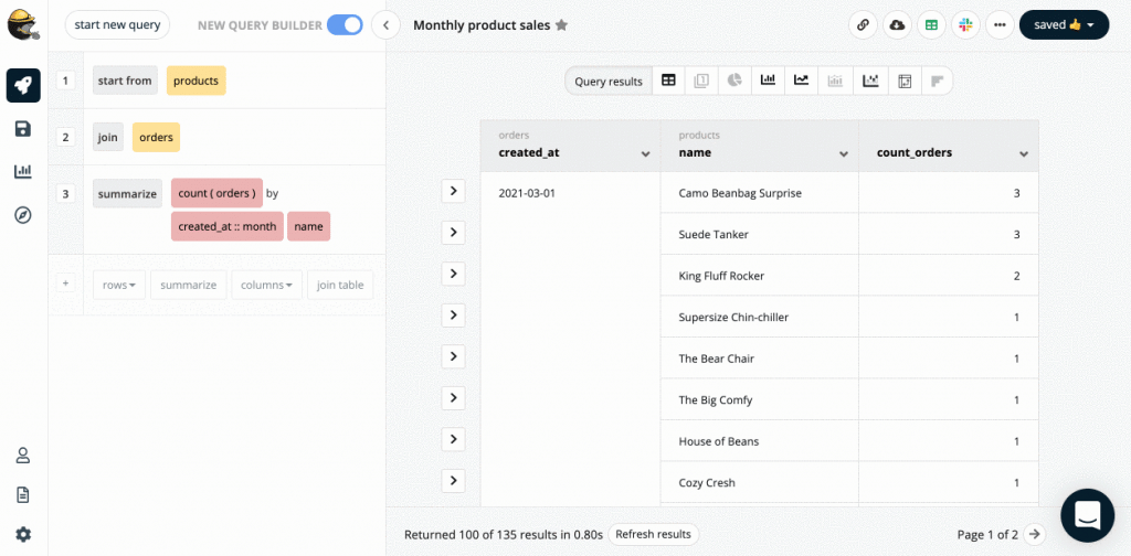
6. Interactive diagrams
Trevor.io detects tables, columns, and joins automatically for you to either add or remove any of that info from your interactive diagram in a click. That makes it easier for you to see possible links when it comes to building graphs and charts for the dashboard. Diagrams get updated in real-time as your schema and relationships change without needing any additional work.

7. Dynamic text boxes
BI dashboards shouldn’t have large boxes of text, but dynamic text boxes can help you highlight metrics that might go overlooked without them. Adding small boxes to enhance a specific metric will allow users to see everything at-a-glance, especially when using BI dashboards that contain lots of information.
For example, if you need to highlight a daily target like a plant's “days without accidents,” or the current cash flow, you can use a dynamic text box.
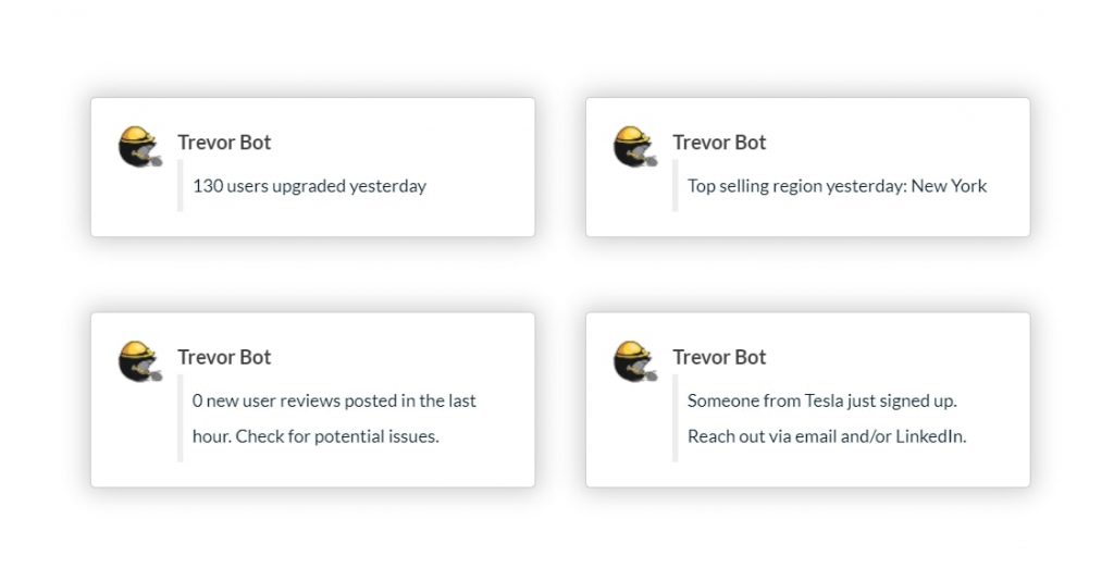
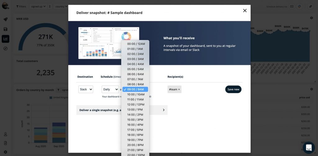
8. Automated alerts and updates
This feature is pretty useful when it comes to visualising the BI dashboard. You can set automated alerts to share snapshots of dashboards automatically to a specified group of stakeholders via Slack or email. You can also request automated updates on the raw data.
Automation for updating a team on recurrent KPIs without finding time for a meeting. For example, let’s say you’re part of the sales team. You can automate Slack alerts to get a daily overview of supply or inventory that you and your team have available to sell on a specific day.
9. Cross-device accessibility
If your team is more likely to be on the go (i.e. sales reps), and not necessarily tied up to a desk, viewing BI dashboards in different formats and devices is an important feature.
Trevor.io doesn’t have a mobile app, but you can get alerts and see snapshots of dashboards on your phone through Slack.
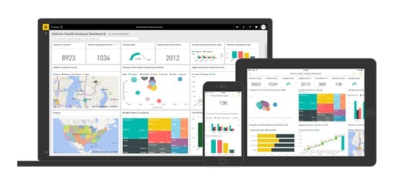
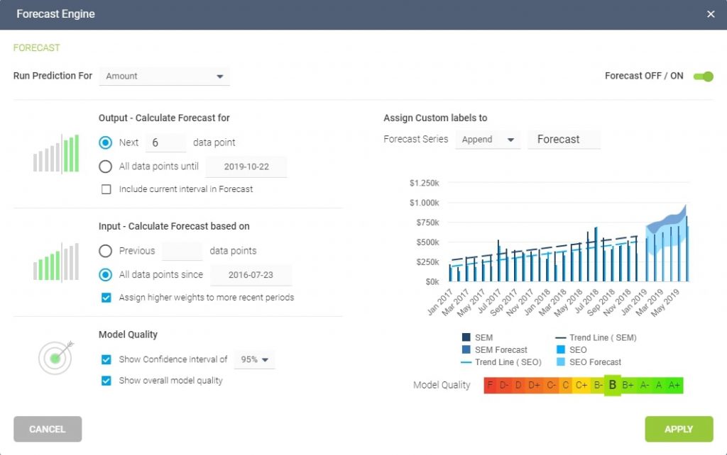
10. Predictive analytics and forecasting
Many BI software companies are working toward incorporating predictive analytics into their dashboards solutions to simplify data forecasting. It works by using predetermined advanced mathematical models to analyse historical data, calculate, and predict the behaviour of certain KPIs.
This feature is particularly helpful to test how a new product launch will behave in a new market, or how sales are going to drop in a period of time (i.e., summertime). PowerBI by Microsoft, has a great forecasting feature.
11. Sharing and embedding
Information is more powerful when the right people have access to it. Look for a BI dashboard tool that allows you to share your dashboards in different ways. Trevor.io allows you to share dashboards via public and private URLs, send information to Google Sheets, Slack, emails, or any other platform through our Zapier integration. Also, it lets you embed your dashboard in your company’s intranet or other needed platforms for proper visualisation.
12. Intuitive query builder
The best dashboard feature is ease of use. That’s why having an intuitive queries builder is highly important. With Trevor.io you can empower anyone on your team to add data sources, join them together, and create ad hoc drag-and-drop queries to get answers in a few seconds.

Want to see if Trevor.io would work for your team? Try it free for 2 weeks!
BI Dashboard best practices
Features can help with data visualisation, but if you’re not choosing the right data to meet your target expectations, then your BI dashboards won’t meet their full potential.
Some business intelligence best practices include:
- Thinking about your audience before building the dashboard
- Making sure that data is easily accessible
- Choosing the right visualisation amongst the different types of BI dashboards
- Identifying the right KPIs to measure and share
- Making the Bi dashboard readable and interactive
Mixing the right features, with the right dashboard type, and following the best practices, you’ll make your team exponentially more empowered to make the right choices within their scope of work.
Bottom line
With the rise of data generation, BI tools will become a primary necessity for businesses to do data analytics.
Trevor.io can become a perfect ally for your business since it’s a self-service, easy to set up, scalable, highly lightweight, no-code required solution. Also, all of your team members can access the platform and create unlimited dashboards with any Trevor.io plan.
The ability to customise columns, colours, maps, bar charts, add filters, drill-downs, drill-throughs, and automate alerts make Trevor.io a great BI tool for any growing business.
Want to see if Trevor.io would work for your team? Try it free for 2 weeks!
Frequently asked questions about BI dashboards
What is a BI dashboard?
BI dashboards are visual and interactive representations of contextualised datasets. Instead of sharing stand-alone metrics or in silos, BI dashboards allow you to present KPIs in a visual way to tell the story of your business.
What is the main purpose of a BI dashboard?
BI dashboards are meant to share data in a visual and interactive way. Their main purpose is to analyse KPIs in context (i.e., year on year), and help teams make faster data-driven decisions.
What should be included in a BI dashboard?
Summaries, visual maps, pie charts, graphs, and dynamic text boxes are all part of a BI dashboard design. These should include key performance indicators measured against each other instead of in silos.
What are the benefits of BI dashboards?
Business intelligence dashboards are favourable in multiple ways. Some benefits include:
- Team members making data-driven decisions
- The company becoming more efficient
- Everyone having aligned priorities and goals
- Team members having easy access to data
- Leaders and decision makers contextualising data and understanding the story behind metrics
- Everyone putting the target audience's interests first and creating customisable dashboards to fit their needs.
How do you structure a BI dashboard?
BI dashboards can be structured as the user finds best. However, some of the best practices include:
- Choosing the KPIs with the audience in mind
- Contextualising data to make it more relevant
- Selecting the right type of dashboard you’ll use
- Drafting the story you want to share with the data, and sketching how you want it to look
- Avoiding cluttering in your analytical dashboards
- Thinking about colour, features, and chart sizes
