


10 Best Practice Tips for Creating Powerful BI Dashboards
Written by
James Watney
Last updated on
December 9, 2022

Business intelligence dashboards fail when your end-users find them difficult to understand and end up losing interest.
Even with powerful BI tools like Tableau, Power BI, or Trevor.io, dashboard designs that don’t account for your audiences, data visualisation, KPIs, and interactivity may result in a hefty investment your stakeholders don’t understand and won’t use.
These 10 BI dashboard best practices will help you design an effective dashboard that offers valuable business intelligence in real-time that your users will actually use.
Table of contents
Want to see if Trevor.io would work for your team? Try it free for 2 weeks!
Step 1: Think of your audience and their objectives
Understanding who will be using your dashboard and what they intend to accomplish with the data is crucial in designing your BI dashboard. Keep in mind that a BI dashboard aims to help the user make informed decisions at the right time.
Overly detailed information may be irrelevant to a decision-maker like your CEO if they’re searching for the bottom line to make business decisions that affect their long-term strategy. Sifting through several graphs instead of pulling from a high-level aggregate may be too time-consuming and deter them from using the dashboard in the future.
For example, a CEO who needs to decide whether or not to pull products from the market needs to see what percentage of the product was sold over each quarter, and in how many states, versus what went unsold.
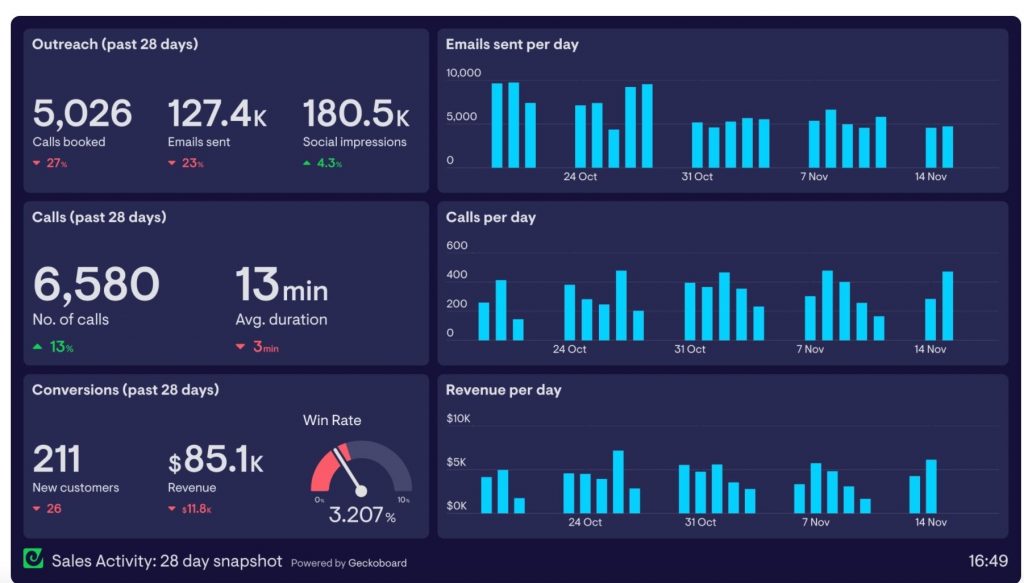
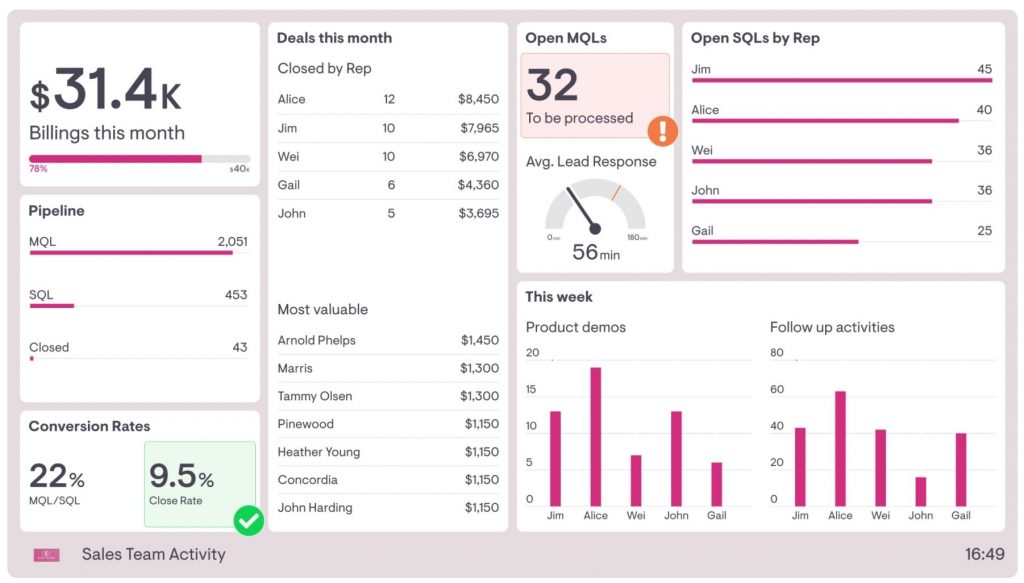
However, managers on your sales team will need microscopic insights into many data points to understand and pinpoint trends they can use to improve their quota for the next quarter. If the aggregate is too vague, the data won’t be useful. For this scenario, a sales team’s dashboard will display data measuring conversion rates, pending sales, revenue, and total sales.
Step 2: Make sure your data is easily accessible through your BI tool (less is more)
Some BI tools will easily integrate with multiple sources of data. Others won't.
Consider the type of software your business regularly uses for your data sources when selecting your BI tool to avoid employing third-party solutions. Companies that rely on Google Sheets wouldn’t opt to use Power BI dashboard since the platform doesn’t directly support it. If a sales manager needs visualisations of their team’s progress from data collected in Google Sheets using Power BI dashboard, they’re required to import the data from one of 2 options:
- An Excel workbook
- A web page
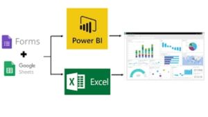
This creates more work for the sales manager by introducing a third party. Tools that require multiple workarounds to function may deter users.
A better choice would be Tableau or Trevor.io. Both BI tools support Google sheets, SQL databases, and several data sources that don’t require third-party integration. Your user will have access to all the data they need easily.
Your BI dashboard should make life easier, not harder, for your team. Before deciding on a dashboard, it is best practice to make sure the tool's scope aligns with your regularly used software. Ensure you choose the best on-premise dashboard software for your business.
Step 3: Identify the right type of dashboard you will need
Your dashboard must match your user’s needs. We’ve already identified the target audience. Now, we must identify the types of business intelligence dashboards that they’ll use in their decision-making. Researching examples of business intelligence dashboards is recommended.
Does your junior sales manager need a strategic dashboard? Will this provide real-time KPIs, data, and metrics to measure their team’s performance for the day? Or does it provide high-level visualisations of their progress over each quarter? An operational dashboard will offer actionable insights they need.
Giving your user data they can’t use may result in them opting for traditional computations in an Excel spreadsheet instead of using your dashboard.
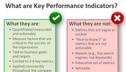
Step 4: Identify the KPIs you are measuring
Your dashboard can only be actionable if it measures data relevant to the user’s objective.
As a rule of thumb, we ask ourselves these questions about our KPIs before creating the dashboard:
- Is the KPI relevant to my team or business goals?
- Is the KPI necessary for regulatory compliance standards?
- Do my employees have any control over the employee performance metric?
- Can I easily measure the KPI?
- Could the KPI be easily abused to twist performance evaluations?
- Does the KPI establish a specific and easy-to-understand performance goal?
- Does this business metric indicate what I really want to know better than other related KPIs?
- Can I set goals with this KPI that can be met in a reasonable timeframe?
If your answer to these questions is ‘yes’, you’re on the right track. Otherwise, you may have created another dashboard that won’t be used.
Related post: How to Create an Effective Business Intelligence Dashboard in 7 Steps
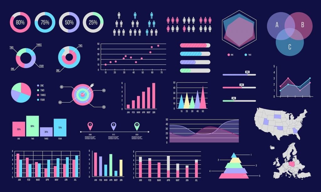
Step 5: Choose your data visualisations and features to fit the audience
Effective data visualisation can be the determining factor of your BI dashboard’s success. Putting emphasis on analysing and modelling your data, then using the wrong chart type to display your results, misrepresents the data rendering it unusable.
Before you start building pie charts, histograms, and a scatter plot, ask these questions:
- What story is your data attempting to tell?
Is your data being gathered in order to identify patterns and evaluate other options? Is it displaying some sort of distribution? Or does it pinpoint correlations between value sets?
Knowing the story behind your data and what it's aiming to achieve can make it easier for your user to choose the proper graph.
- Who will you present your findings to?
The goal of data visualisation is to make it easy to communicate the results of the data. Even if the data is the same, you can use different graphics for distinct groups of people. A beginner to the stock market might benefit from seeing a simplified version of a stock market trends chart, while a seasoned stock trader would prefer more granular detail.
- How big is your data set?
Are you collecting high volumes of data? Not all charts can display all sorts of data. Pie charts, for example, operate well with a limited number of datasets. If you're working with a large number of datasets, though, a scatter plot makes more sense.
Select a chart type that best fits your data’s volume and displays it in a clutter-free manner.
4. What is your data type?
Is it categorical, continuous, qualitative, or descriptive? The type of data you use has an impact on the graphic you create. A bar chart might not be the ideal option if you have continuous data. You might have to use a line chart instead.
5. What is the correlation between the different elements of your data?
Finally, consider how the different pieces of your data are related. Do date, size, or type classify your information? Is it a variable-based ranking system? Or is there a link between variables?
Does your data change over time, meaning it is a time series? If not, is it a distribution?
The link between the values in your dataset should help you choose the right data visualisation.
Step 6: Tell a story with dashboard data placement
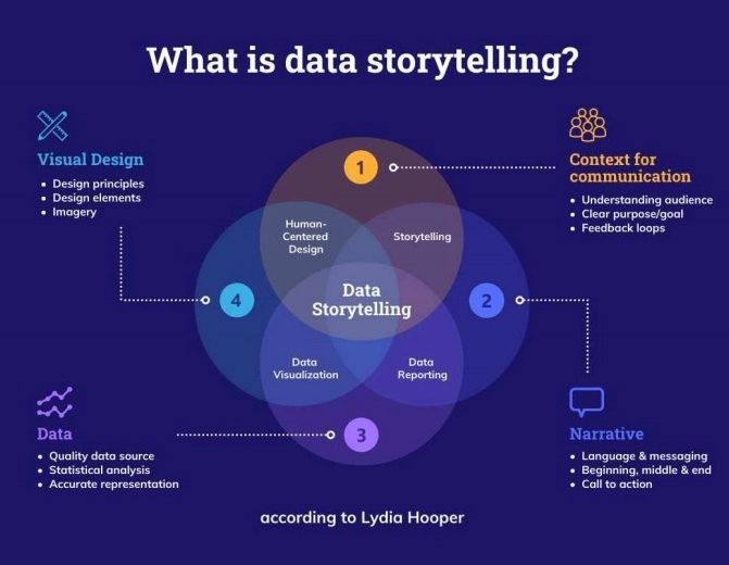
Place the most important information at the top. You can use data to prove anything, but how compelling is your data story? Data storytelling requires context: what’s the point you're attempting to make? Who are you talking to?
If your data answers the ‘why’ (such as ‘why customers are churning’), organise it in a top-down format that highlights the problem (in this case, the churn rate), followed by exploratory data, right down to the root cause. As you descend the information ladder, your visualisations should start to incorporate contextual data that proves the reason for the churn.
When a data set can clearly explain to your user how it gets to its conclusion, they’ll find value in it and will be more likely to rely on your BI tool in future. If the information does not provide context or is hard to follow, users become confused and may not use the data at all.
Related post: 12 Powerful BI Dashboard Features for Successful Decision-Making
Step 7: Answer the ‘why’ as well as the ‘what’
Your data is less useful without context. Showing what happened without also explaining why it happened may cause users to misinterpret the data. Instead, provide additional visualisations that give context to your answers.
A sales team manager may notice a downtrend in the percentage of sales for the week. Adding data that also shows the number of calls received could provide the manager with the insight needed to decide on the KPIs. If the manager observes a downtrend in the number of calls and sales, they can adjust their metrics to account for this change.
A line chart clearly showing both downtrends is the best fit for this instance. This way, your visualisation answers both the ‘what’ and the ‘why’, and the user will find the data useful.
Step 8: Make it readable
Overall, user experience boils down to readability. If your users find it hard to read the dashboard because of visual design, they’ll likely misunderstand the information your dashboard is trying to communicate.
- Again, less is more. Clutter is both off-putting to the user and can be overwhelming. Don’t try to put as much information as you can squeeze on your dashboard just to avoid missing anything. Instead, offer the most relevant data sets. Your user will find your dashboard visually appealing and easy to understand.
- Spacing is your friend. Just like the widgets on your smartphone, users will find your dashboard easier to read when the data sets don’t appear to be bleeding into each other.
- Too many colours are distracting. Depending on the presented variables, try to limit your colour scheme to 4 colours maximum.
Don’t let the simplest elements of your data visualisation harm the overall effect - prioritise the spacing and colour choices so your users can appreciate the full potential of your visualisations!
Step 9: Make it an interactive dashboard
Not all data is relevant to your user’s research, and they may become overwhelmed by data they don’t know how (or want) to use. Interactivity gives them the freedom to explore the ideal dashboard for them.
Using software with the right features will help you quickly understand existing relationships in your data by generating an interactive diagram.
For example, with Trevor.io, charts are more customisable with slicers, editable labels, and colour schemes to match your company branding. You can build and share unlimited dashboards that cover high-level as well as drill-down data visualisations for easy business decisions.
Be sure to create a dashboard with visualisations that can be removed or filtered when needed. This will help each user get the most out of the dashboard every time they use it.
Step 10: Don’t forget to gather feedback
If the target audience isn’t using it. It’s not a good dashboard. That’ obvious. But you’ll need to gather detailed feedback as often as possible to improve your tool.
Only your end-user can tell you exactly what the shortcomings of your dashboard are. So getting their feedback is key to understanding how you can improve your BI dashboard design and make them more useful. It may also give you insights into how to create a business intelligence dashboard ideal for your users altogether.
Related Post: 6 Affordable Alternatives to Geckoboard That’ll Take Your BI Dashboards to the Next Level
Key takeaways for BI dashboard best practices
The target audience, software used, visualisations, dashboard type, KPIs, readability, and interactivity all impact how much your tool is used. So, when building business intelligence dashboards, always consider your user’s experience.
Dashboards that aren’t optimised with the core audience in mind are often useless to the user and can deter them from using the BI tool in the future. Data visualisations that are cluttered, hard to read, and don't add context can be misinterpreted or considered irrelevant.
Making your tool interactive gives your users freedom to customise the dashboard to suit their needs, and gathering feedback helps you to improve your dashboard. Choose a powerful platform like Trevor.io to create your BI dashboard, and follow these 10 steps to improve your user experience and overall success.
Want to see if Trevor.io would work for your team? Try it free for 2 weeks!
Frequently asked questions about BI dashboard best practices
What makes a good BI dashboard?
A good BI dashboard makes complex data analysis simple, actionable and easy to understand.
What are the best practices in dashboard design?
When designing a business intelligence dashboard, you should follow these best practices:
1. Identify your audience.
2. Select a dashboard that easily integrates with multiple platforms, so data is easily accessible.
3. Identify the right BI dashboard type for your audience.
4. Know the KPIs you need to measure against.
5. Choose the data and visualisations that suit your audience.
6. Tell a story with the data.
7. Provide data that gives context.
8. Make sure your dashboard is readable and uncluttered.
9. Incorporate interactive elements to allow your user to get the detail they need.
10. Always gather feedback.
What is included in a business intelligence dashboard display?
A business intelligence dashboard display has actionable metrics in charts, graphs and labels.
What should be included in a business dashboard?
The KPIs and metrics included in your business dashboard are dependent on your desired audience. Carry out thorough research to understand the end-user and tailor each element to meet their needs.
What are the most important aspects of BI dashboard best practices online?
The most important aspects of business intelligence dashboard best practices are
1. Using visualisations
2. Maximising readability
3. Using interactive elements
4. Gathering feedback
